Okay, folks we’ve made it to the third and final entry in my Met roundup, where I try to wrap up everything else that I saw after I escaped the first floor of the museum (and try not to think about all of the stuff I didn’t have time to see). A truly impossible task, but we shall endeavor to hit some highlights all the same.
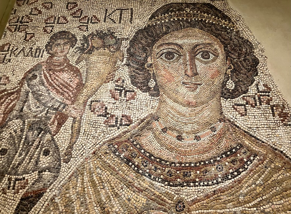
To perhaps provide a bridge between the ancient world and the early modern one, the Met has this beautiful Byzantine mosaic, depicting Ktisis, a personification of generosity, with a smaller male figure holding a cornucopia emphasizing her spirit of giving. Unlike a similar allegorical figure we might have seen last week in the Greek and Roman wing, you can see that Ktisis is dressed like a wealthy Byzantine woman of the sixth century, with extensive jewelry and a later imperial hairstyle. Her assistant also wears clothing fashionable for a rich young man of the period, complete with a reddish cloak likely meant to depict the imperial purple of a murex-dyed cloth. Although you can’t see it in my cropped photo, Ktisis also holds a tool used to measure Roman feet (the distance, not the anatomical item), suggesting that she was a record of a donation toward a building project.
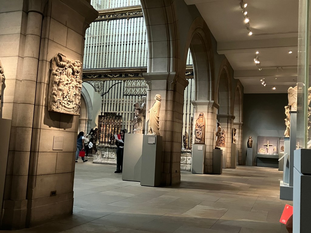
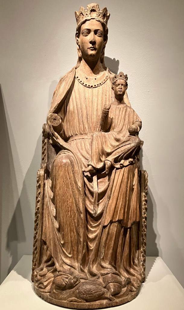
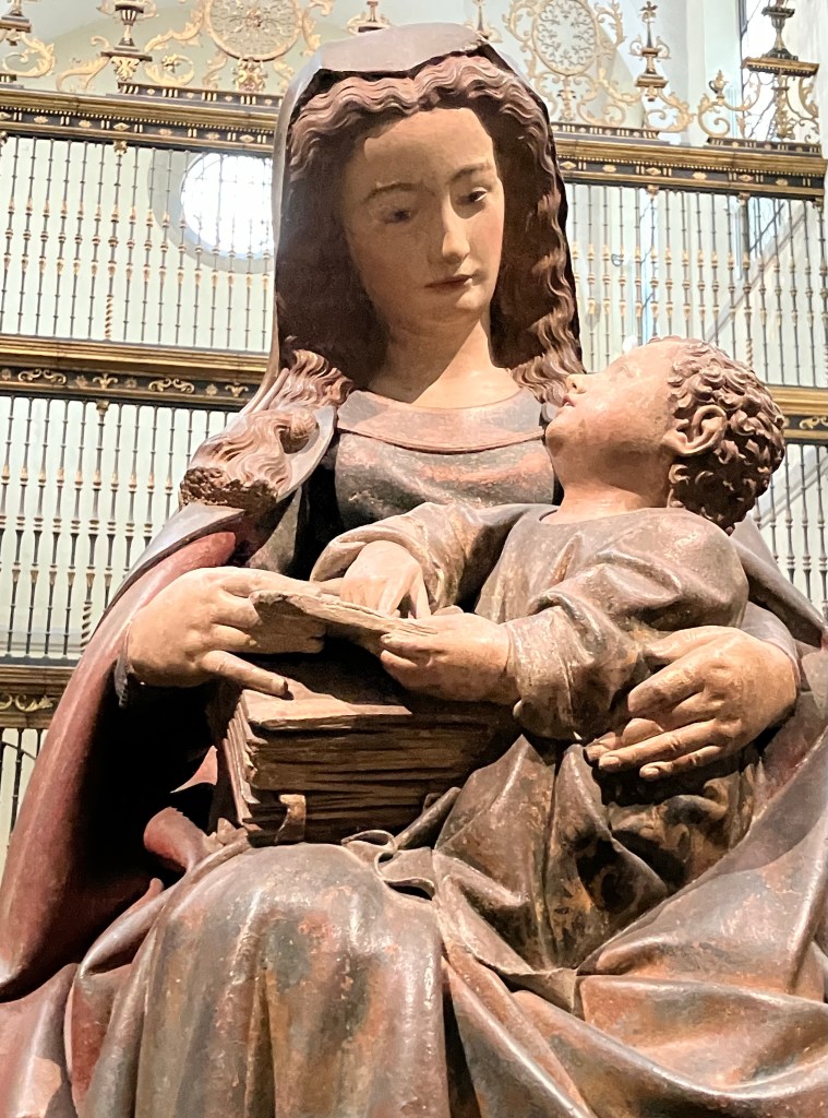
But before we leave the first floor, there is the medieval wing, a lot of which is tied up with an extensive collection of period armor and more Madonna statuary than I could fathom. Though, as we’ve discussed before, medieval Madonna statues are also a bridge between the old and the new, as many of them take their iconography from earlier religions like Egyptian depictions of Isis and Horus.
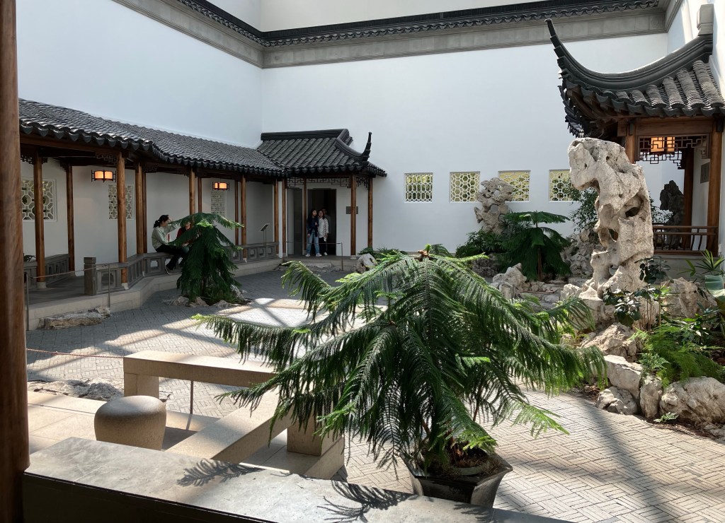
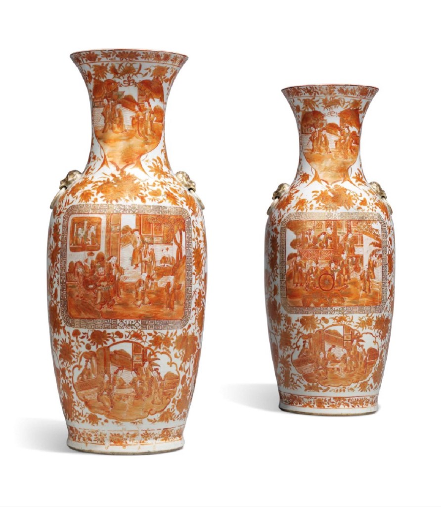
Up on the second floor, the Asian Art galleries dominate an entire side of the floor, with most of the space taken up by Chinese art, especially from the Tang (618-907 CE) and Ming (1368-1644 CE) dynasties.
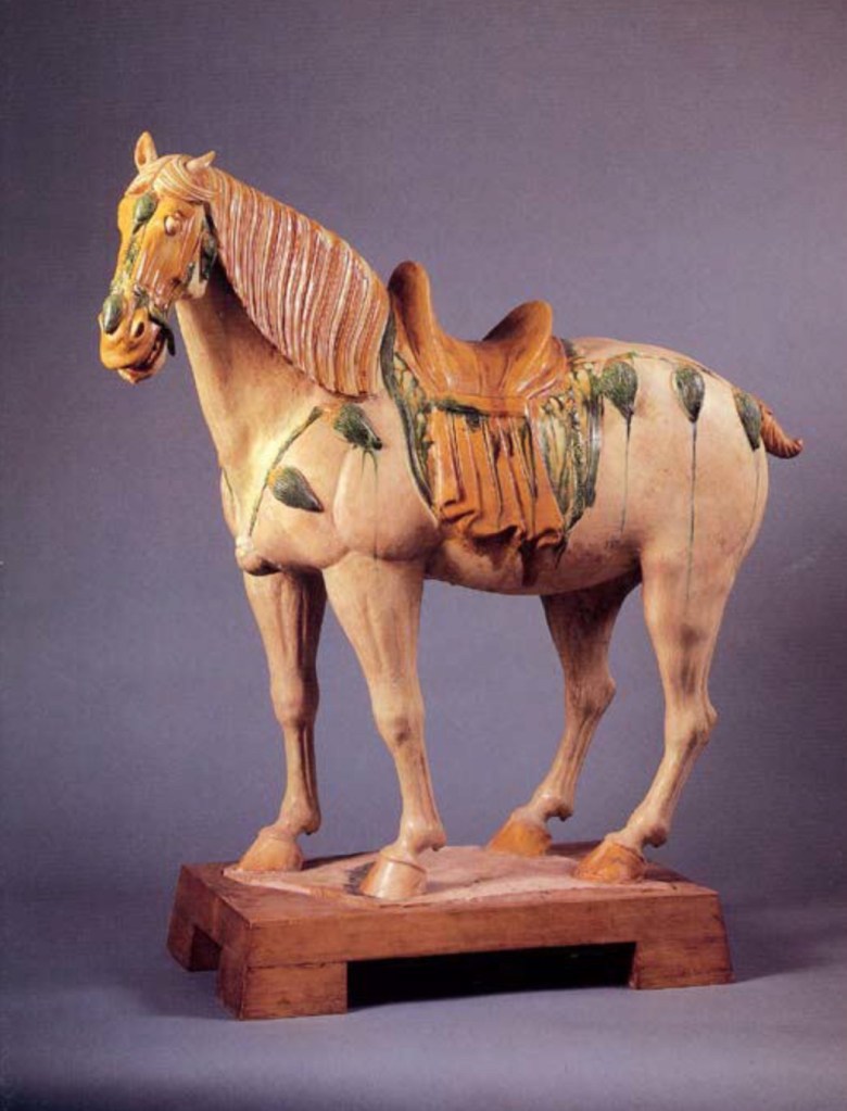
Unsurprisingly, my introduction to Tang art as a child was through pictures of the dynasty’s eponymous pottery horses, glazed through a technique called sāncǎi (三彩), “three colors”—referring to the brownish amber, green, and off-white that the firing typically produces (though blues and blacks are also possible). Sāncǎi was developed around 700 CE, and its original primary use was for funerary figures, in part because the low-temperature glazing and earthenware pottery was cheaper and easier to produce than higher-quality porcelains, and also suitable for both small and large scale pieces. The glaze is made from lead, and the non-white colors are produced by adding metal oxides to the base glaze. Oxides that produce the browns and greens were fairly inexpensive, hence why most of Tang pottery is these colors; meanwhile blues could only be made with cobalt which was far rarer and therefore used much more sparingly.
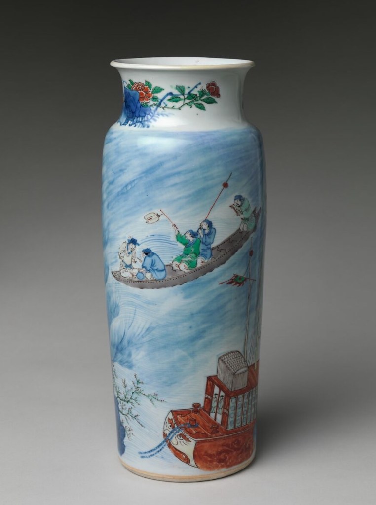
You might think of glazed pottery horses when you think of Tang art, but porcelain vases are what most people think of when you hear “Ming art.” And rightfully so, as Ming artisans perfected the porcelain and celadon techniques to produce some of the most beautiful tableware ever made. But unlike perhaps the classic blue and white pattern ware that might immediately spring to your mind, Ming ware was often best denoted by its masterful use of rich colors of every stripe. This particular vase depicts a scene from a contemporary play, The Story of the Blue Robe (Qingshan bao). In the play, a young scholar (a typical protagonist for a Chinese story of the period) Liang Hao aids the disguised Daoist immortal Lu Dongbin during a thunderstorm and is rewarded with the three things a young Ming man wanted in life—a beautiful bride, a successful government career, and a long life. Episodes from famous literary works were a perennial favorite topic for Chinese ceramics, a trend that would continue in the following Qing era, where scenes from the contemporary Dream of the Red Chamber would often appear on vases and plate ware.
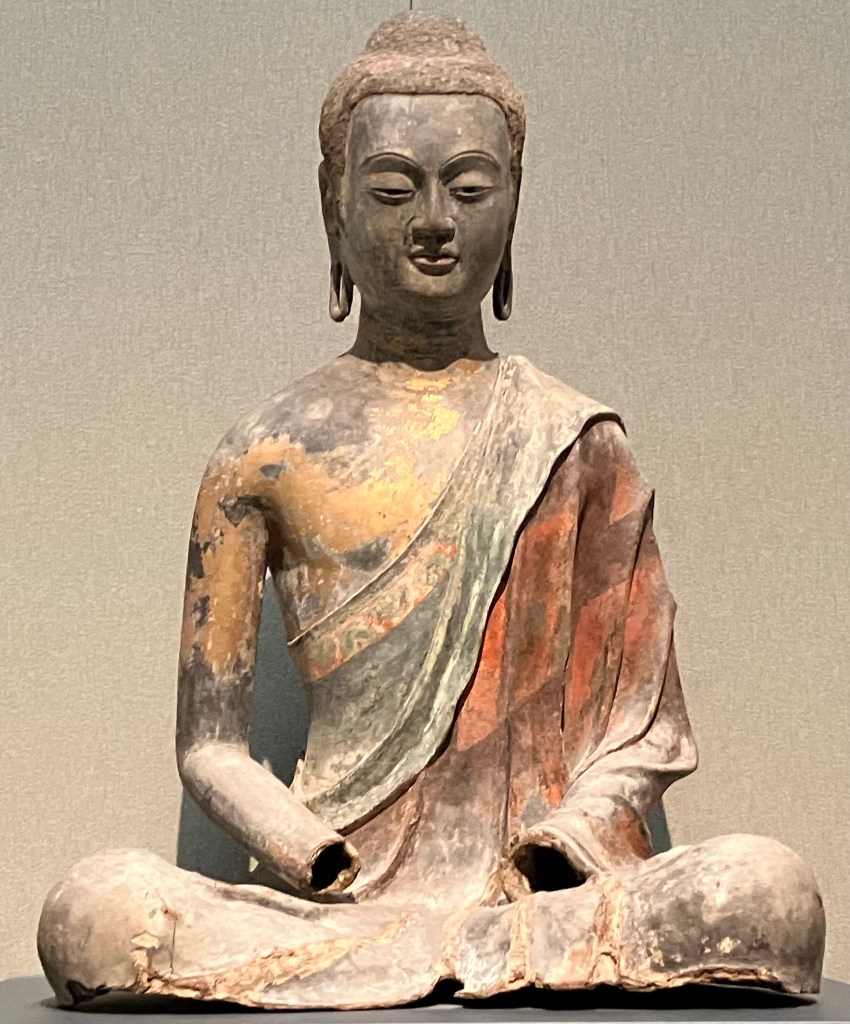
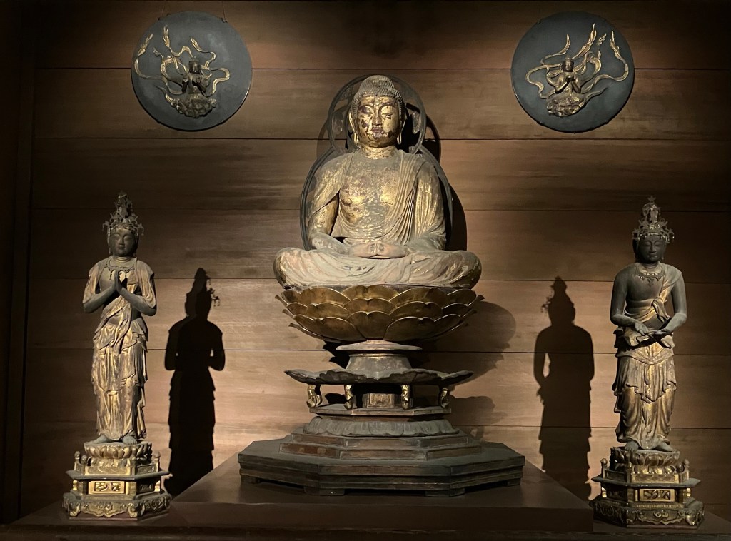
But Buddhist religious statuary was important in both the Tang and Ming eras, and the Met has numerous examples of both. The Tang Buddha above is believed to be Amitābha, the principal buddha of Pure Land Buddhism, a sect of Buddhism that was extremely popular throughout Asia during this period and for several centuries after. Amitābha was supposedly an Indian monk named Dharmākara, who after acquiring substantial merits over his many lifetimes was able to achieve buddahood and create Sukhāvatī (“possessing happiness”), a pure land to which all who called upon his name would be reborn, and where they would be instructed by him to achieve their own release from the cycle of death and rebirth. Amitābha Buddhism would be the Buddhism of the Heian court in Japan, and it comes up frequently in the diaries of noble ladies of the 9th century like Murasaki Shikibu and Sei Shōnagon.
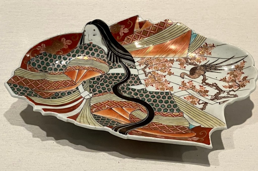
The Met didn’t have nearly as much Japanese art as they did Chinese, and even less of that was Heian era (794-1185 CE) pieces, but they did have this lovely little dish that while from the much later Edo period (1615-1868 CE), shows a noblewoman dressed not in contemporary fashion, but that of the Heian period, with the traditional jūnihitoe (十二単) “twelve layers” dress and the long, unbound hair that was the style of the time. Court ladies like Murasaki and Sei Shōnagon were judged by how skillfully they combined the many layers of the jūnihitoe both in terms of colors and patterns, as well as how those corresponded to things like rank, season, and even time of day; and Sei Shōnagon’s Pillow Book (枕草子, makura no sōshi) is famous for her withering critiques of other ladies’ styles.
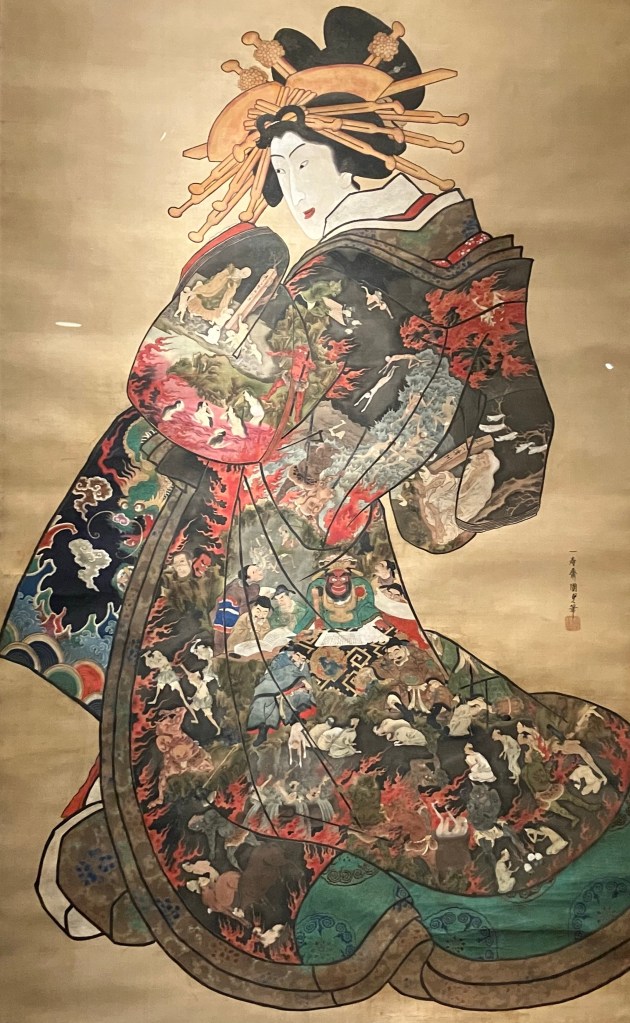
Conversely, Edo period print artist Utagawa Kunisada II dresses his 15th century female subject in the style of his own time rather than her own (the Muromachi period). This is a print of one of my favorite Japanese folklore personalities, the so-called Hell Courtesan (Jigoku dayū), who as far as we can tell first appears in stories from the Edo period. The Hell Courtesan was the daughter of a samurai who after a series of familial catastrophes is sold into sex work. Trained as a yūjo, an upper-class courtesan, the beautiful and witty Hell Courtesan gives herself her nom de guerre as a way of mocking her misfortunes and she is known by the fantastic kimono that she wears, which depicts various demons and scenes of the underworld. Through a series of clever interactions with the historical iconoclastic Zen monk Ikkyu (1394-1481), the Hell Courtesan supposedly achieves Buddhist redemption despite the sins of her past and current life.
While the contents of the Hell Courtesan’s famous kimono are as varied as the imagination of the many artists who have drawn her, here Utagawa Kunisada II shows scenes of Enma-o, a judge the dead and one of the kings of Buddhist Hell (he’s the guy near the middle with the red face). The men beside him are seven other judges, who review and record the misdeeds of the recently deceased, who you can see cowering before them. On the edges of the kimono, you can also see people being hounded by various demons and suffering other forms of punishment.
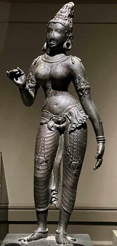
Moving geographically south, the Met also has a wonderful gallery of Chola era (848-1279 CE) Tamil copper statues from Southern India. This statue of Parvati, the consort of the god Shiva, is very emblematic Tamil Hindu art, with her hair wrapped up in a conical crown and sinuous form. The Chola Empire covered much of modern Tamil Nadu and Kerala, and Shiva and Parvati were important local deities, particularly Shiva in his Dakshinamurti incarnation—“The Lord Who Faces South.”
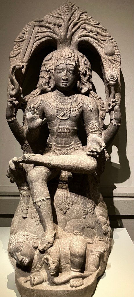
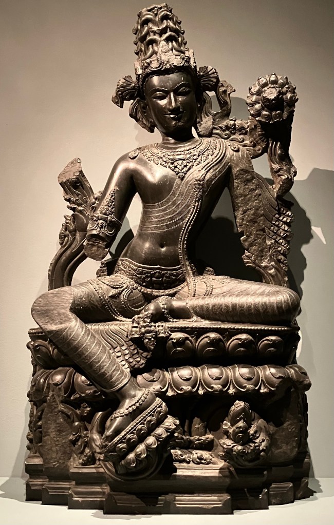
Although at the northern extreme of Chola influence, the statue above of the Buddhist bodhisattva, Lokanatha, from Bihar shares many of the same artistic inclinations as the Tamil pieces. Lokanatha is the “Lord of the Universe,” the supreme Buddhist savior, and the highest embodiment of Buddhist compassion.
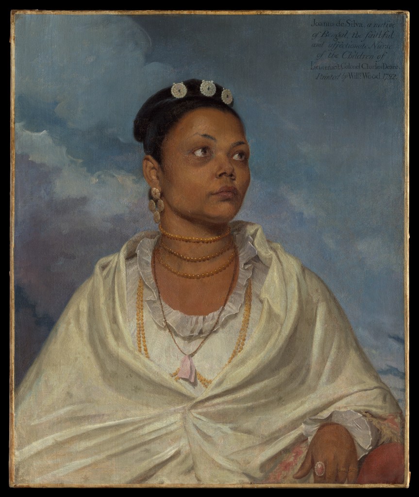
To build a bridge between the Asian wing and where I moved next, the pre-1800 European art wing, this is a portrait of Joanna de Silva, a Bengali woman who worked as an ayah or nursemaid for an Anglo-Indian family, the Deares. William Wood had the opportunity to paint her when she accompanied her orphaned charges back to England, though what became of her afterwards is unknown. Very unusually for the period, where servants of color were often used as “exotic” background furniture in white family portraits, de Silva is portrayed on her own and named in the description Wood paints in the top right corner of the portrait. Her name suggests that she herself might be biracial—the daughter of a Portuguese man and a Bengali woman—or perhaps it signals an Indian-based Portuguese convent education that might have made her an attractive hire to her English employers. Wood’s description calls her “faithful and affectionate” to the Deare children, and indeed she must have had some standing in the family to have been given the responsibility of seeing them safely to England. Her status with the Deares is also signaled by her clothes—likely muslin, silk, and calico—the premier luxury textiles that the British East India Company exported to Europe from India. De Silva wearing them not only points to her native land, but also that her employers were well-off enough to see her dressed in clothing that reflected their social status and ability to buy such items for their help.
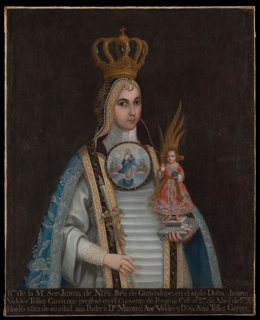
Another interesting portrait in this part of the museum is of a Mexican teenager, whom we only know by her religious name: Sor Juana de Nuestra Señora de Guadalupe. To quote the Met’s description: “This portrait commemorates a ceremony during which its sixteen-year-old sitter professed the vows of a nun and entered the Mexico City convent of Regina Coeli. She is dressed in the distinctive habit of the Order of the Immaculate Conception, who were popularly known as “blue nuns” after the color of their robes, and wears the nuptial crown and rings that identify her as a bride of Christ. The portrait would have been displayed in the home of her parents, where it not only recalled the absent child but also expressed the family’s wealth and piety.” As with Joanna de Silva’s portrait, you can some of this information written along the bottom of the painting, including the date of Sor Juana de Nuestra’s profession—April 27th, 1797. The large cameo painting at her throat is typical of Mexican convent portraiture of the time, Sor Juana de Nuestra’s obviously depicting the Virgin Mary, likely flanked by her parents, Saint Joachim and Saint Anne, as a metaphorical representation of the aforementioned Immaculate Conception (which refers to her sinless birth, not Christ’s).
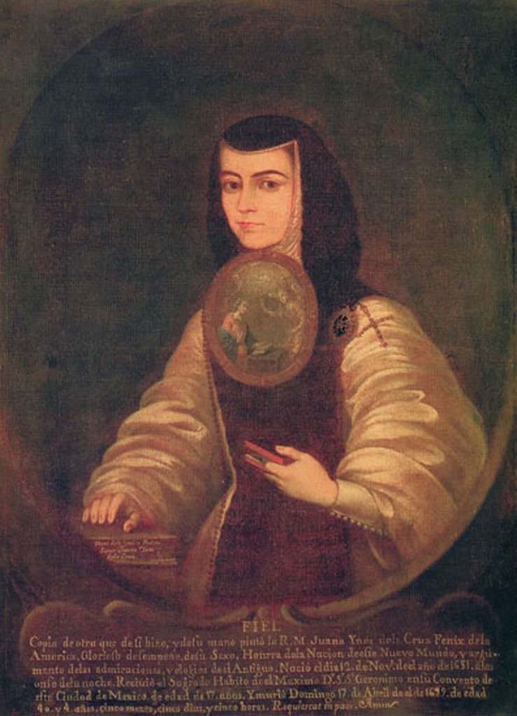
Compare that portrait with the one above of Sor Juana Inés de la Cruz by Friar Miguel de Herrera from a generation before. Sor Juana was a respected Mexican religious writer, philosopher, poet, and composer who is sort of the Hildegard von Bingen of Mexico. Notice how Sor Juana’s Carmelite habit differs from the OIC habit of Sor Juana de Nuestra.
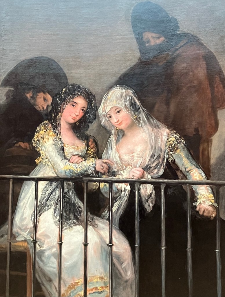
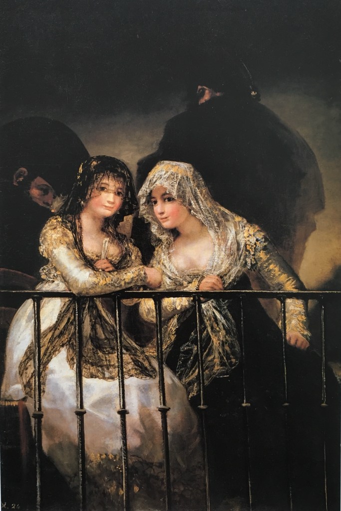
Before we hop over to the American wing and wrap up, I wanted to point out this Goya painting for a couple of reasons. One is, for me, I always forget that maja is a generic term—in part because it’s so connected to Goya’s famous Naked Maja and Clothed Maja—so I always think of “Maja” as specifically another de Silva, María Cayetana de Silva, the Duchess of Alba, who is the subject of those paintings. But “maja” is the name given to early 19th century Spain’s fast young women about town, known for their expensive and exaggerated versions of traditional Spanish dress. Here in Goya’s painting, we’re mainly talking about the ladies’ sheer lace mantillas that they wear over their Empire dresses.
But the other reason I wanted to highlight this painting is because it ties back to our old theme of replica versus originals. Because this is a copy of a more famous “finished” version of this work (seen below). That one is in a private collection, but the Met speculates that Goya used its version to experiment with the compositional elements of the piece. It’s also possible that the Met painting is the work of another artist in Goya’s workshop, but either way, it’s a fascinating look into the artistic process.
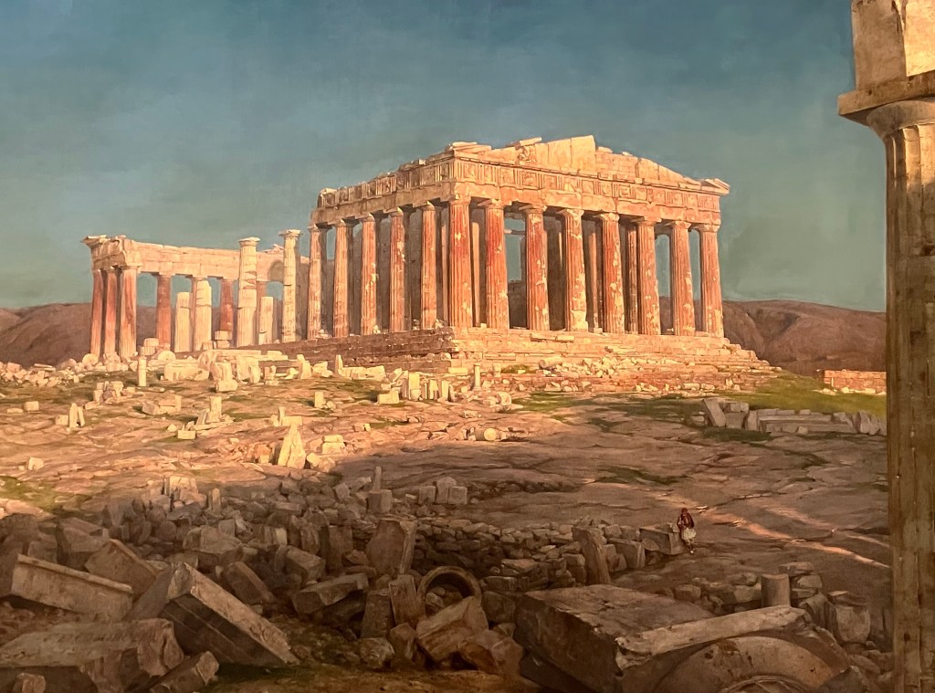
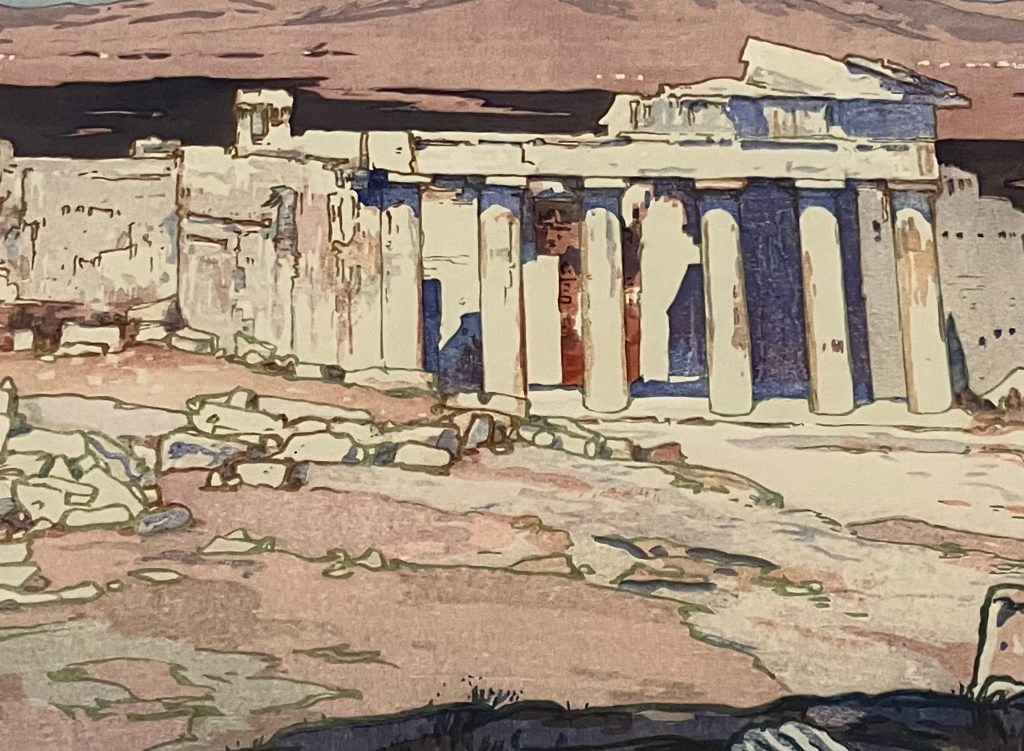
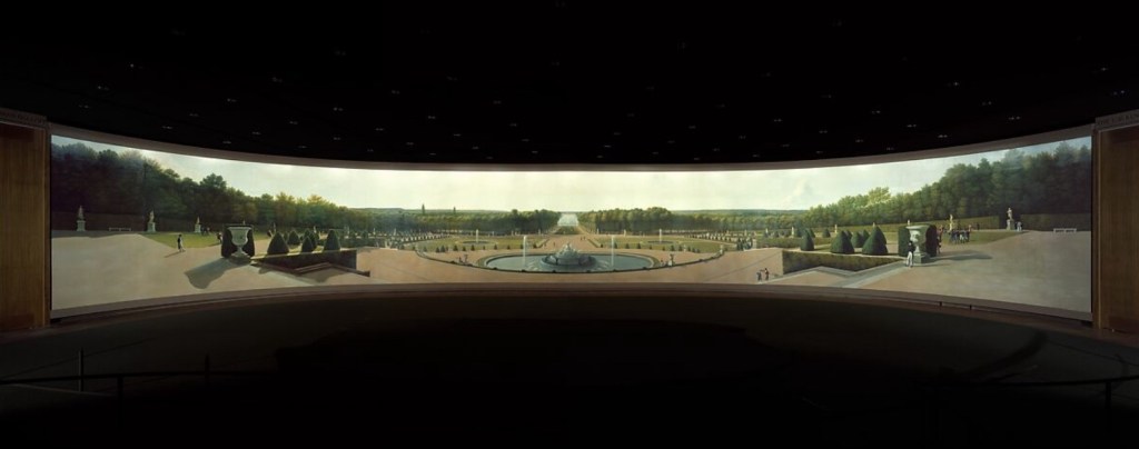
I know we’ve been doing a lot of portraiture, but one of the first things that grabbed be in the American galleries was this landscape of the Parthenon, because it immediately reminded me of Yoshida Hiroshi’s woodblock print of the Acropolis that I’d seen at CMOA last fall.
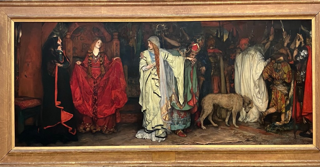
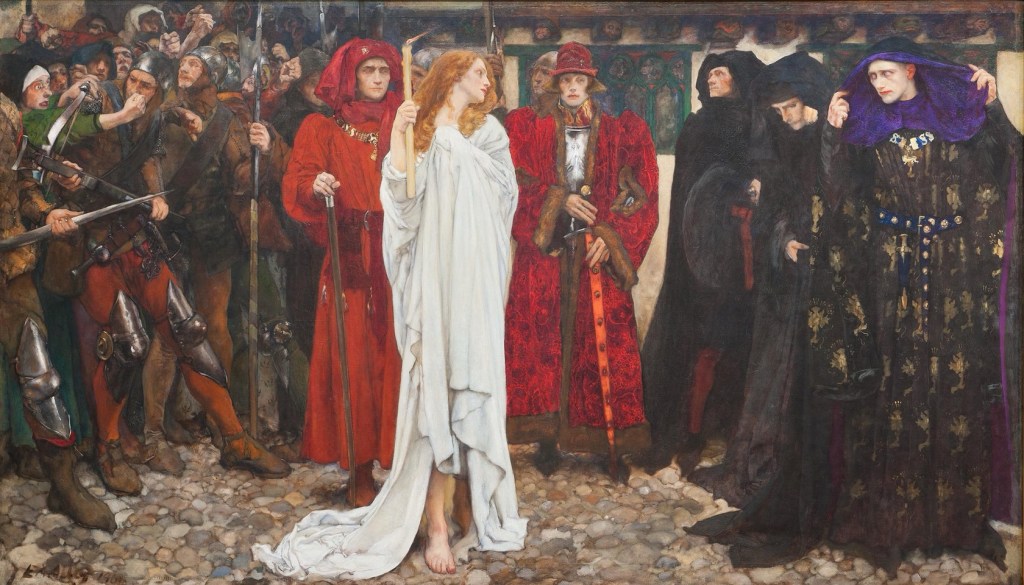
And speaking of CMOA, I also ran into another sort-of familiar face in this Edwin Austin Abbey painting of Act 1, scene 1 of Shakespeare’s King Lear, where a disowned Cordelia leaves to marry the king of France while her sisters look on. I recognized Abbey’s work from a similar painting from his Shakespeare series that CMOA has that depicts a scene from Henry VI, part 2, where the duchess of Gloucester must walk the streets of London as a penance for consulting with necromancers against the life of the king. As you can see, both are done in that rich Edwardian style that later became known as “the golden age of illustration” in Britain and America for traditional subjects like Shakespeare and the Arthurian myths.
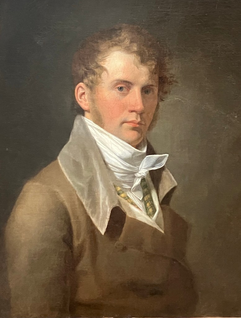
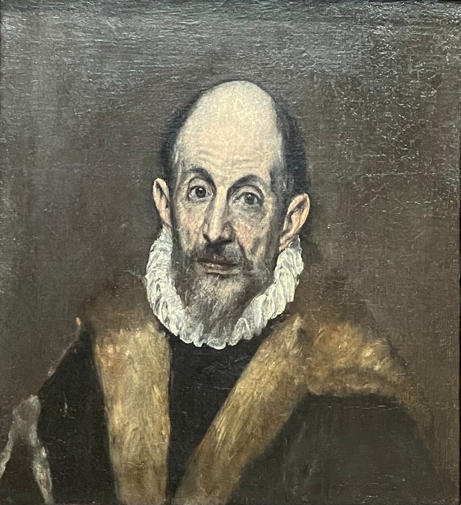
I also got to see my old friend and Flight of Virtue bit player John Vanderlyn, which was a nice surprise, here in one of his better-known self portraits. And tying in with my book, this painting was specifically a gift from the artist to his first and best patron, Aaron Burr, which is just a fun bit of trivia for you all.
So yeah, that was a taste of my Met experience. I hope you enjoyed some of what I showed you at least half as much as I did. There was so much to take in that even as we were riding the train back to our hotel, I felt like I had to plan a whole other day there right away. But who knows when I’ll be back in New York, so until then, we’ll get back to different things next post and dream of new museums for the future.

Leave a comment